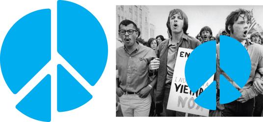
The Brian Lehrer Show is asking you to re-imagine the peace sign.
Image


Nacer Ayesh
This design is a universal symbol for world peace. A concept that was created with the intention of achieving such a goal by spreading love to one another. This simple message of "You, Me, One" represents a world of equality within all mankind. The idea was originally introduced by a friend named Roger Green, which I later created it into a symbol to share to all. We believe this image is our next Peace sign that will change the world.

Roman Scott

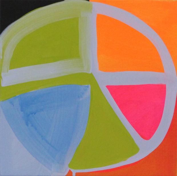
This re-imagined peace sign proposes a shape based on the square, whose four sides evoke more a feeling of wholeness for me. The shape of the square symbolizes stability, but not that of authoritarian power. Rather, this peace is based on balance, never to be taken for granted. This is a human idea that aspires upward, yet nestles between two hemispheres, evoking the earth, or leaves, or hands. Made of basic shapes, it can be drawn simply, like the classic 60s peace sign we know.
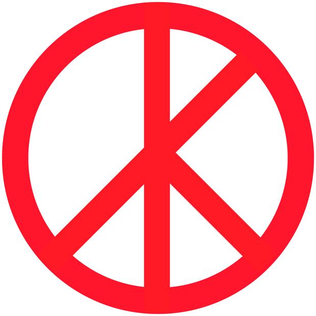
David Puketza
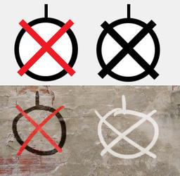
I wanted to devise a symbol that could be scrawled quickly, especially during times of conflict or struggle. Believing the bomb to be the antithesis of peace, my symbol merely crosses it out. No bomb = peace. I wanted to replace the abstraction of the current peace sign with very direct communication regarding concrete things - stop bombing.
Tsipi Ben-Haim
This design is the logo for CITYarts' Pieces for Peace project, which aims to build bridges of cultural understanding between youth in the United States and their peers around the world.
The project consists of art education workshops that connect youth worldwide through the creative process. The workshop participants, ranging from 10 to 20 years old, are asked to create 6x6 inch artworks in the form of paintings, poems, drawings and collages to communicate their thoughts and dreams for peace. Under the direction of artists and/or teachers, workshops take place in schools all around the world. So far, we’ve received over 4,500 artworks from almost 100 schools in 65 different countries, each becoming a “piece” in our online mosaic puzzle. We believe that art and the ideas of youth can create change, and in the case of this specific project, add to the movement for peace. The artworks can be seen on our website gallery at: http://www.cityarts.org/Pieces-for-Peace/view-artworks/index.php
We hope that by asking children to visualize their dreams of peace through the creative process, we can empower them to become active participants in changing the future.
As you discuss peace in your End of War series, I would love to share with your listeners CITYarts' efforts to engage children around the world imagining a peaceful future.
Abbey Klotz
This reimagined version of the peace sign emphasizes interconnection and movement. Peace is not static but is maintained through balance and a willingness to engage. Additionally- to draw this sign is to experience these concepts on a non-verbal kinetic level, a silent emphasis that peace is a multidimensional process.
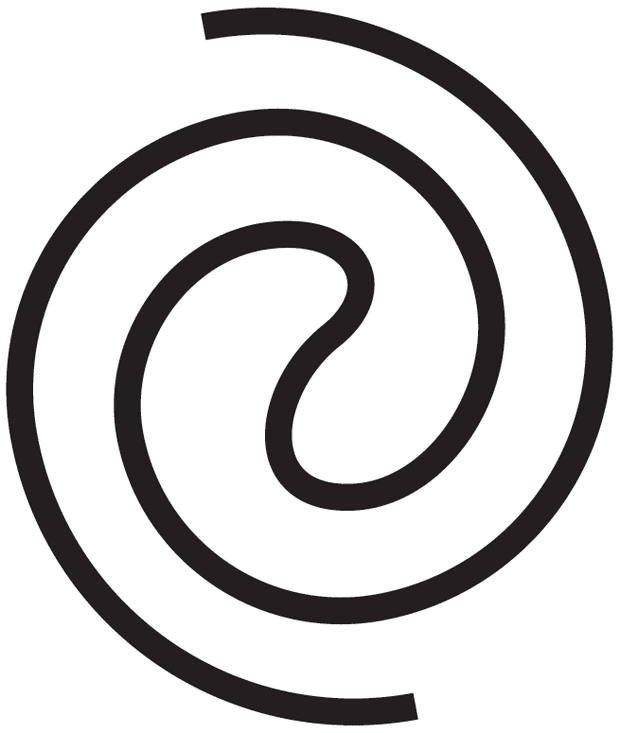
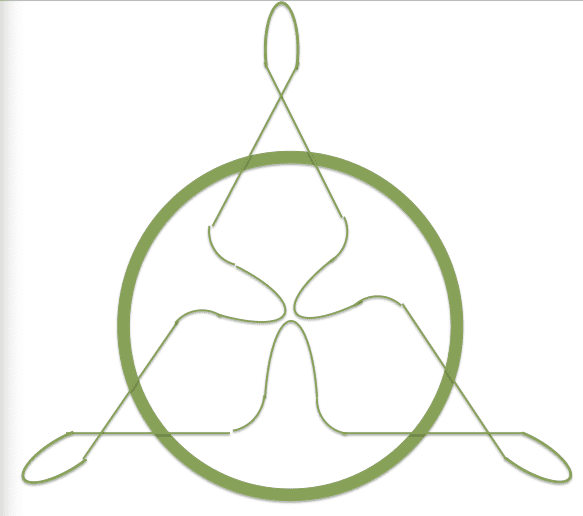
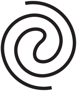
Abbey Klotz
This design for a re-imagined peace sign is based on a fusion of the circle with it's meaning of unification, inclusion and togetherness, with the spiral or the knot, indicating interconnection, infinite movement and humanity (this mortal coil.) I wanted to maintain the reference to '3' from the original peace sign, so there are three loops, indicating "us or we," as well as other positive metaphors associated with the number 3.
Brad Silk
This design was made in an attempt to update the peace sign yet still keep the nostalgic form intact. Any new design should really be removed from the daisy-toting 70s movement. Personally, I love the 70s movement and ideals, but they are outdated for todays society.
The second goal for this re-imagined design was to make it a window or stamp to be posted over image(as seen put over the anti-Vietnam war protest image)...
ps: LOVE Milton Glaser. Entered a poster design contest back in 2005 or so about anti-seal poaching.
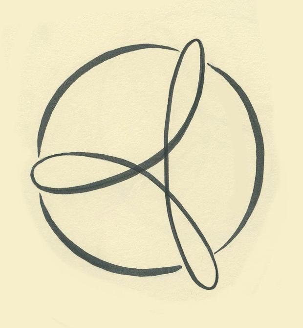
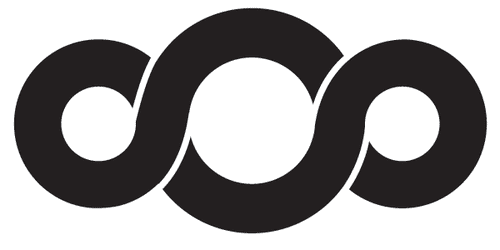
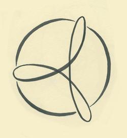
Ze'ev Willy Neumann
I call my piece a "Love Knot" it a symbol 0f love & infinity combined,(as in love forever).I'm in a proses of creating two of them in 3D .One will be place in Woodstock & one in Saugerties they each will have a plaque directing you to tie the Knot of friendship by visiting the other one.
Carey
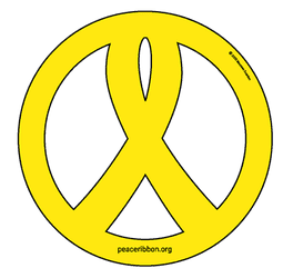
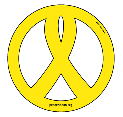
Sorry, I failed to include an image before! -- http://peaceribbon.org/ This is my mother Maureen Scanlon's re-design of the peace sign incorporating the yellow ribbon. "When the US during the Bush administration first invaded Iraq, so many of us were caught off guard by the onslaught of those yellow "Support Our Troops" magnets that simultaneously invaded our roadways. How did they become so widespread at such a fast pace? How did those magnets quickly morph from a neutral stance in support of our troops to a pro-war, pro-Bush, anti-peace agenda? The Peace Ribbon™, based on the peace symbol, takes back the yellow ribbon, and represents support for our troops through striving for peace. "
Mary Anne Pennington
After listening to this segment I decided to take a few minutes to stop what I was doing and redesign the peace sign. I have always felt a sign for peace should be a bit more opened up in appearance than closed inside of a circle.
I took a literal approach and took the circle and lines apart and used the exact pieces to put them back to gather in a new way. The funny thing is I created this person with arms open as if to embrace for a hug, a sign of love and comfort, but actually looked a great deal like the female sign.
I played around a bit more with the angle of the lines, which created an arrow pointing to a united circle, a symbol of completion and connection. Unity. It still appears to be an individual with open arms.
John Bostrom
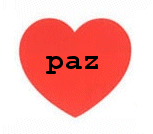
Any re-imaged peace symbol that hopes to gain popular acceptance must embrace the attitude expressed in Michael Jackson's deservedly popular "Man in the Mirror" - "if you want to make the world a better place, take a look at yourself and make that change." If peace doesn't come from within, it's simply not genuine and won't make it. This symbol simply and directly places the word for peace, in any language, on Glaser's famous heart (tribute!)
The original peace sign is inherently problematic. The designer, Gerald Holcomb, says that it's basically an abstraction of despair - "Goya's peasant before the firing squad." He regretted the negativity of this design, and the British organization for whom he made it apparently adopted the only slightly less negative explanation that the designs stands for the semaphore letters N and D (for Nuclear Disarmament) = a construct that deservedly remains in the archives of obscurity. Nevertheless the basic message conveyed by the symbol remains, if not despair, then "surrender" - laying down your arms. This is how it was widely understood in the sixties. Protesters would even extend their arms downward to become "human peace symbols." Which plays right into the image of peacemakers as cowardly, gutless, irresponsible if not drug-addled hippy-dippy flower children who really stand for nothing, at least nothing requiring any effort or discipline. Hardly the case, but that's the enduring legacy of the image.
Dan Springer
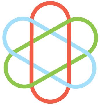
I'm trying to represent the number 3 to show unity and how we are all connected, an to also have the interconnectedness extend beyond our own preconceived "cirlce".
The number 3 appears in many cultures and religions over our history, but also represents "spirit, mind and body" and "past, present, and future".
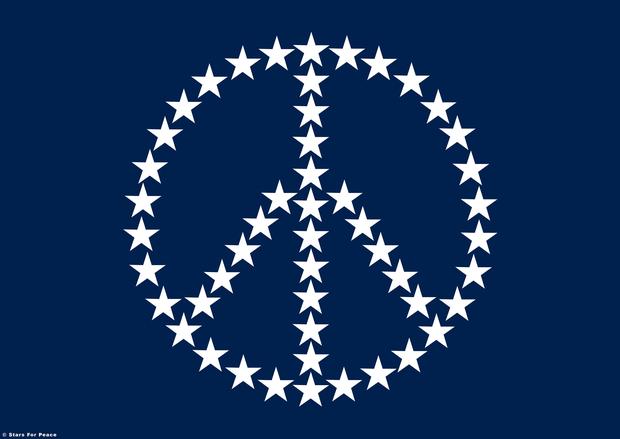
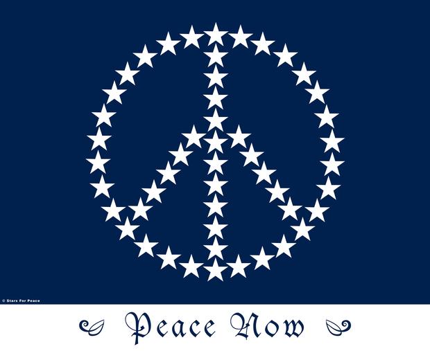
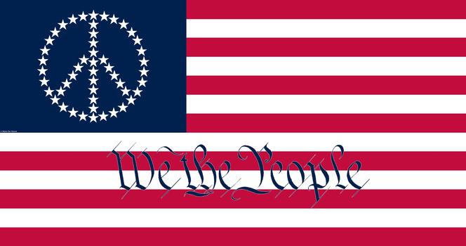
TJ Colatrella
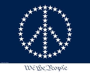
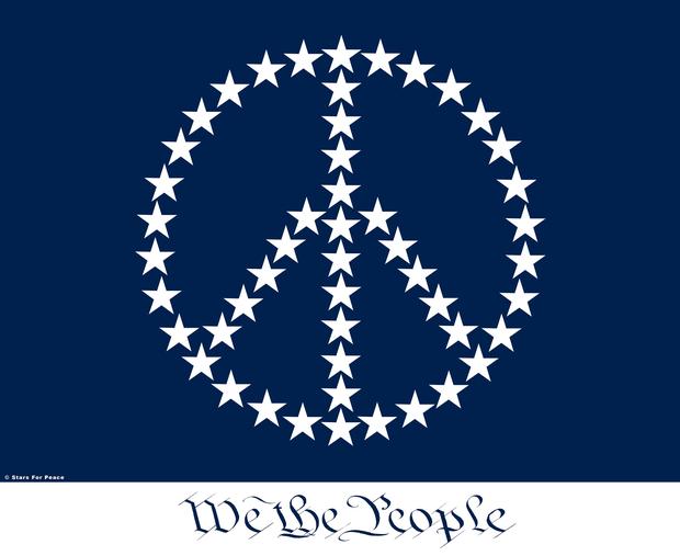
This is one of my designs Stars4Peace there are other variations I know the plain one was already submitted by a friend...there are others...including this design on the full flag.. I did it on canvas and then it was done with the help of Alan Shear to computer.. It is the only time I've ever seen it done geometrically correct and there is a trick to doing it, I had to figure it out for weeks, and even had to show Alan how to do it the same way on computer! I submitted it to the Library of Congress Art section to Copyright my design and they freaked out big time and refused me any copy right.! I sent this to Milton personally immediately after doing it, he saw it before any outsider and was willing to give me any help I asked of him but I think he really liked it..! The Art Section of the Copyright bureau argued with me and at one point when I brought up "Intellectual Property Rights" told me to call Lou Dobbs! Also it is done to government scale and government spec. there are two versions or sizes one so big a flag for flying from bridges could be made or and can be projected onto buildings or even into the sky possibly! I sent it around everywhere no bits of takers even when offered always for free usage!
It seems when you do something truly original the public does not get it..I've learned that on several occasions.. If you Google Stars4Peace you'll see other variations of my design.. one thing Milton a true genius of design and I both know about it shooting an image or even writing or making a statement that goes to the Back of the Brain and Stays.. that was my purpose for Stars4Peace and also much of my song writing as well.. My songs are different and often unique lyrically which is why many producers and radio stations don't know what to do with them..! One example is my song Murder in the Heartland.. Not many people write a song that is meant to not be liked or leave one uneasy.. one person heard it and said that song is horrible and I said Thank You it's supposed to be..! Yours TJ Colatrella Boiceville NY
Andrzej Jakub Olejniczak
Do we need NEW standard for PEACE symbol?
I don't believe that humanity desire to peace has changed since the beginning of time…
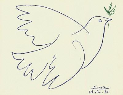
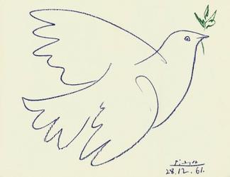
I think Picasso did really great job.
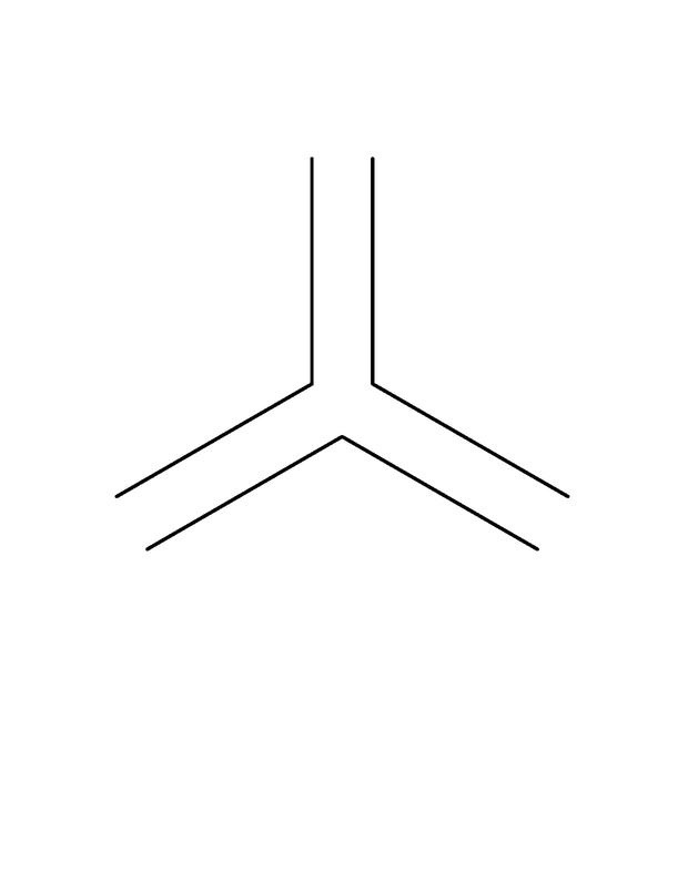
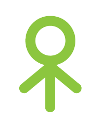
Muriel Stockdale
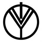
This symbol means - I enter world and greet you with love. The world is the circle, I am the top line which is shown partially out of world to honor that we are greater than our form. The you is the bottom Y which not only means other people but all others - animals, plants, oceans and the earth itself. The V which separates I and Y is love.
This symbol is activated, standing tall, arms outstretched reaching for participatory peace and not passive expecting peace to land on us. It is like a tree of life, or a rune of the sacred man, the transendent man that contains and represents all things. In representing I You and the interaction between us in world it also speaks to the idea of Father, Son and Holy Ghost - that triun celebrated and honored in all religions and philosophies considering how we interact with our reality is our choice. It is a core issue which when shifted permits us to live in love and harmony instead of enmity. I know we can do it.